3384 Insights
Your go-to source for trending news and information.
Charting Your Course: Navigating the World of Data Visualization Software
Discover the best data visualization tools to elevate your analysis and make your data stories unforgettable! Start charting your course today!
Top 5 Data Visualization Software: A Comprehensive Comparison
In today's data-driven world, utilizing the right data visualization software is crucial for making sense of complex datasets. Whether you're a business analyst, a marketer, or a data scientist, the tools you choose can significantly impact how effectively you communicate insights. In this article, we will examine the top 5 data visualization software options available in the market, evaluating their strengths and weaknesses to help you make an informed decision.
1. Tableau: Renowned for its user-friendly interface and powerful analytics capabilities, Tableau excels in transforming raw data into interactive visualizations.
2. Power BI: Microsoft's solution integrates seamlessly with Office tools, making it a popular choice for businesses familiar with the Microsoft ecosystem.
3. QlikView: Known for its associative data indexing, QlikView provides dynamic dashboards that cater to real-time data exploration.
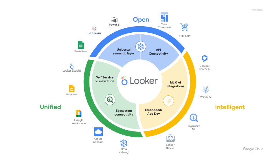
4. Looker: Ideal for modern data teams, Looker offers robust customization options and strong integration capabilities.
5. Google Data Studio: Being a free tool, Google Data Studio is perfect for those looking to create visually appealing reports without breaking the bank.

How to Choose the Right Data Visualization Tool for Your Needs
Choosing the right data visualization tool is crucial for effectively presenting your data. Start by assessing your specific needs: consider the type of data you are dealing with, the audience you want to reach, and the complexity of the visualizations you want to create. You should also evaluate key features such as ease of use, customization options, and integration capabilities with other software.
- Identify your data type (e.g., numerical, categorical, geographical).
- Determine your audience and how they will interact with the visuals.
- Check for compatibility with existing tools.
Additionally, consider your budget when selecting a data visualization tool. There are many free and premium options available, each with its own set of features and limitations. Don't forget to take advantage of trial versions to test the tools before committing. Paying attention to user reviews and comparisons can also guide you in making an informed decision. In summary, finding the right tool involves a combination of understanding your requirements and exploring different visualization options available in the market.
Common Mistakes to Avoid When Using Data Visualization Software
When using data visualization software, it is essential to avoid common mistakes that can hinder the effectiveness of your visual representations. One frequent error is overwhelming viewers with excessive data clutter, which can lead to confusion rather than clarity. To enhance comprehension, focus on simplifying your visuals by limiting the number of data points and emphasizing key trends. A good practice is to use charts and graphs that tell a clear story, allowing your audience to grasp the essential information at a glance.
Another mistake to avoid is neglecting the importance of color choices in your data visualization. Colors can significantly impact how data is perceived; thus, using too many or clashing colors can make your visualizations difficult to interpret. Aim for a cohesive color palette that enhances readability and highlights crucial data points. Additionally, always ensure that your visuals are accessible to all users, including those with color blindness, by incorporating text labels or patterns to distinguish between different data sets.